Reporting was a tough mountain to climb for marketing ninjas before the release of Looker Studio made life easier. It automated a whole lot of things and reduced the panic steps of having different reports for each platform.
Creating a report on Looker Studio might be a piece of cake but figuring out what to display and how to use the tool smartly is a big deal. In our previous looker studio tutorial, we discussed in detail about getting started with looker studio.
In this article, we will discuss few tips and tricks to use looker studio to save time and easily design a report that will make your boss/client happy. You can even check our work to get deeper insights by clicking here.
Advanced Techniques to Master Looker Studio
1. Setting up your layout
The first thing you should do after connecting your data sources is to setup your report layout. There are multiple options to configure your theme in looker studio but I will discuss few important ones.
Once you land on the empty canvas, you will see theme layout and style options in the right sidebar. Let’s look at the layout options in the below image.
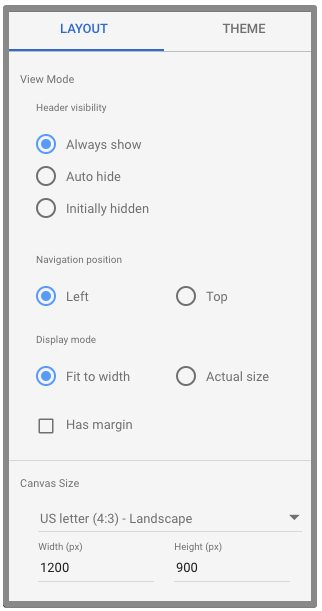
a. Header visibility:
This option is for controlling the header. To view the report in full size, select the auto hide option, this will hide the header when you view the report. To get back to edit mode, just move your cursor on the top and it will appear.

b. Navigation position:
Use this option if your report consists of multiple pages. Choose the left option if you want to see the pages listed on the left side of the page, otherwise, you will have to use the drop-down option. Checking the ‘has margin’ checkbox will only display the canvas. Otherwise, it will add the theme background color to the whole report screen and your report might look like photo studio wall.
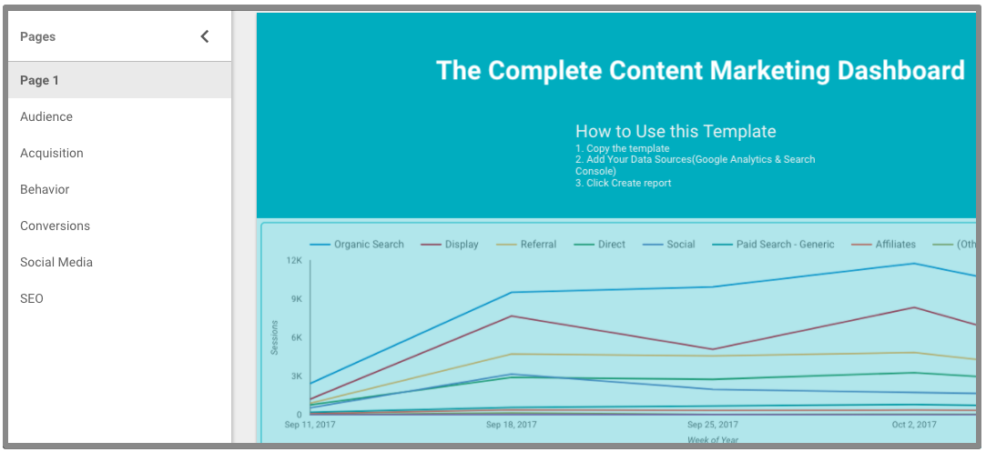
checkout our Looker Studio content marketing template to see how navigation position looks.
c. Display Mode:
When you select the navigation position as left, you should select the display mode as ‘fit to width’. This will modify the screen width and fits according to your screen size.
d. Canvas size:
By default the canvas size is 1200 * 900, however, you can always change the height and width of the canvas according to your needs. Some choose to have all the reports on the same page and some prefer to have multiple pages instead.
You can navigate to theme section to select the colors and theme style you want to have.
2. Report length & theme
Most of the people can’t decide what to display on the empty canvas. This is another essential thing to figure out before you draw any diagram on the canvas. What would you do when you have to fit all the Google Analytics reports into a single 1200 * 900 canvas?
Obviously, you will want to add the most important data on the canvas. If you decide to have a single page report, you will have to be careful about the important reports related to your website. Add the most important on the top and move down with the less important things.
However, if you want a multi-page report, put the summary of the most important reports on the first page and display related reports on each pages.
Secondly, most of the business owners/clients want to have the report theme matches their website. So before choosing a color theme yourself, open your client’s website and decide if you can create something that resembles the website. Or if you are feeling aesthetic enough, make use of your aesthetic sense.
3. Page Level Changes
Pages in Looker Studio allows you to have multiple dashboards. It is useful for creating multiple types of reports. For example, you can create a social media report in a new page which will only display data related to your social media channels or an SEO report.
If you are creating multiple reports on a single page and want to add the same settings across all reports, you can use page level settings.
For example, if you want to keep the same data source and filter on all reports on a page, you can use page level settings.
To do this, click on the page from the toolbar and then click current page settings.
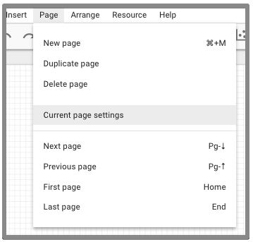
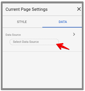
Select data source from the right menu
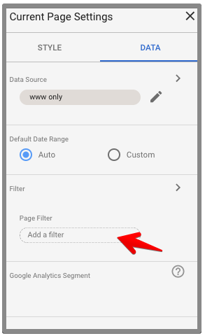
To apply a filter on the page level, click Add a filter button.
You can only change background color in page settings. Click on the style tab and select the color you want.
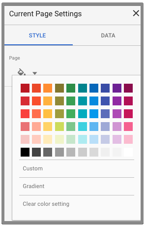
Once you set changes on the page level, you will not have to change for each dashboard separately after you create the report.

4. Report Level vs Page level
Looker Studio allows you to save changes on the report level and also page level. Report level means the whole report, regardless of the number of pages and page level means every single page.
Report level items can be header, footer and any filters that you want to keep across all pages. If your report consists of around 10 pages, you will never want to draw a new header on every page.
For example, if you have created a header on your first page and want to copy on all pages, follow the steps below.
Select the items you want to keep on all pages. Single click for selecting one item or press command/ctrl and click multiple items.
Once you select the items, right click on the items and click Make report level.
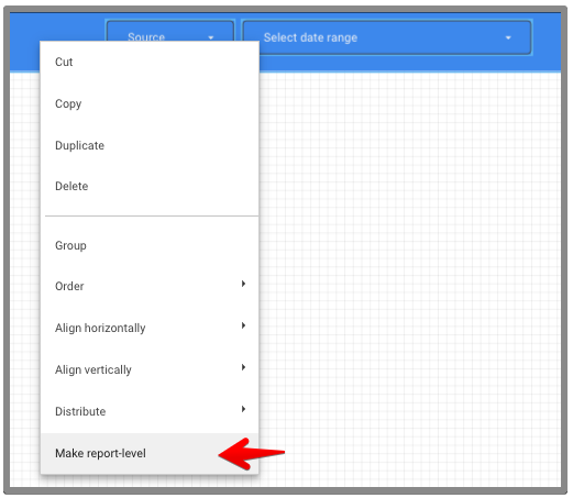
This will save you a lot of time to focus on other important things.
5. Playing with Calculated Metrics
Calculated Metrics are those that have been derived from standard metrics. You can create your own metrics according to your need within looker studio. For an ecommerce store, one of the calculated metrics can be product list views drop. We can calculate this using standard metrics with a given formula below.
Product List Views Drop % = (Product List Views – Product List Clicks) / Product List Views
To create a calculated metric in Looker Studio, select the dashboard and add a new metric. Click on plus (+) icon to create a calculated metric.

Enter the formula as shown in the below image and click create field.

With calculated metrics, you have the opportunity to display more data on the report. You can also create these calculated metrics in Google Analytics and use them in Looker Studio.
6. Embedding Report
Now you can easily embed any report on your website page. This is definitely a good opportunity to show awesome reports to your audience.
You can embed a report in edit mode or view mode. To embed a report in edit mode, click on File >> Embed Report.
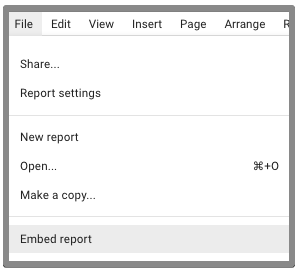
The second method is available in both edit and view mode. You can embed by clicking on the ‘<>’ icon on top right.

You can either embed code or embed URL, adjust the size and then copy the code.
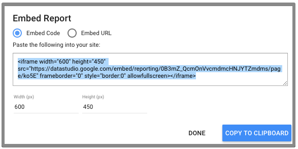
7. Change the table layout
Looker Studio stands out due to visualization. You can use styling to make your report more attractive and focus on data that is more important. To make a table look more appealing and interactive, you can change how the data is displayed in columns.
Let’s look at a simple table below and how we can change it to make it the data more interesting.
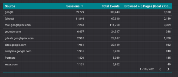
We can change how data in each metrics column will appear by changing the styling of the table.
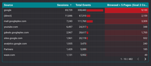
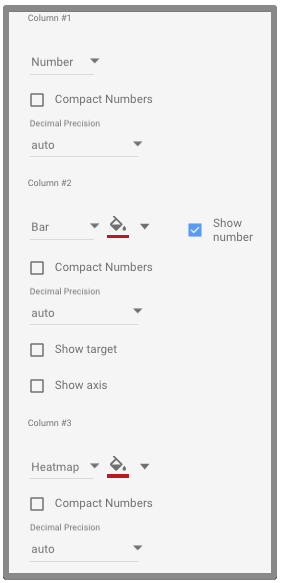
To do this, you have to select the table and go to style settings from the right menu. Scroll down to see the columns settings and change how data in each column will appear.
Conclusion
Looker Studio is definitely a great tool for reporting but what matters is how you import and analyze data to achieve your business goals. It takes you far ahead in achieving your objectives through the efficient use of data.

