If you are curious about Looker Studio and have been digging around on the internet for a comprehensive and detailed guide, you have come to the right place. In this step by step Looker Studio tutorial, you will learn how to use Looker Studio and will be able to create informative & engaging reports for your decision makers or even just for yourself.
What is Looker Studio?
Looker Studio is a FREE data visualization tool that allows you to import data from multiple sources and visualize them on a report that is easy to read and share. You can import data from any source using Google Sheets or Data Connectors to create the report you want.
Why Looker Studio?
But what makes Looker Studio so marketable? Let me educate you a bit about the pros of this Analytical marvel. The difficulty most marketers face these days is to figure out which information to convey in data reports to their clients.
There is always this factor to overwhelm a certain individual with dense analytical info that might overwhelm them. Which is why a lot of marketers refrain from reporting back because they are not exactly sure where to start from.
Looker Studio has the pioneering capability to transform your data and dry statistical reports into the most attractive and easy to read format, that can be effortlessly digested by your clients or your business handling individuals.
“Looker Studio marks the birth of a new era of how organizations consume, share, and use analytics data to drive insights and create even greater business value.”
The exciting news is that Looker Studio is now available for everyone and supports unlimited templates. To create a report in Looker Studio you need to do a few things first:
- Sign in to your Google account
- Migrate your data in a cloud based data source(i.e Google Analytics, Adwords, Sheets)
The Looker Studio features & functionalities are not final yet and the updates rolling out gradually. With increased customer demand and usage the Looker Studio team is working hard to bring new features that will make Data Studio a unique and exciting tool for building reports.
Benefits of Looker Studio
Looker Studio is a new tool that has been added to the Google 360 Suite. The tool is built to create dynamic, visually appealing reports & dashboards.
Some of the benefits of using Looker Studio are:
- You can create comprehensible and understandable reports
- Pull data from multiple sources – a single report can use data from two or more sources
- Create dynamic reports – easy to refresh data
- Create fully customizable reports – drag & drop
- You can get updates in real time
- You can create unlimited reports
- It’s FREE
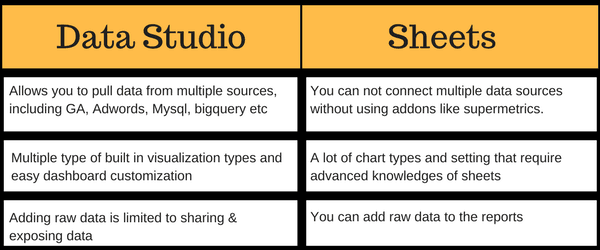
Looker Studio vs Sheets
Looker Studio cannot be considered as an alternative to Google Sheets. If Sheets are meeting your end goals you don’t really need to switch to Looker Studio. But, Looker Studio is built on top of Sheets with some extra amazing features. Below are few of the differences between Looker Studio & Google Sheets.
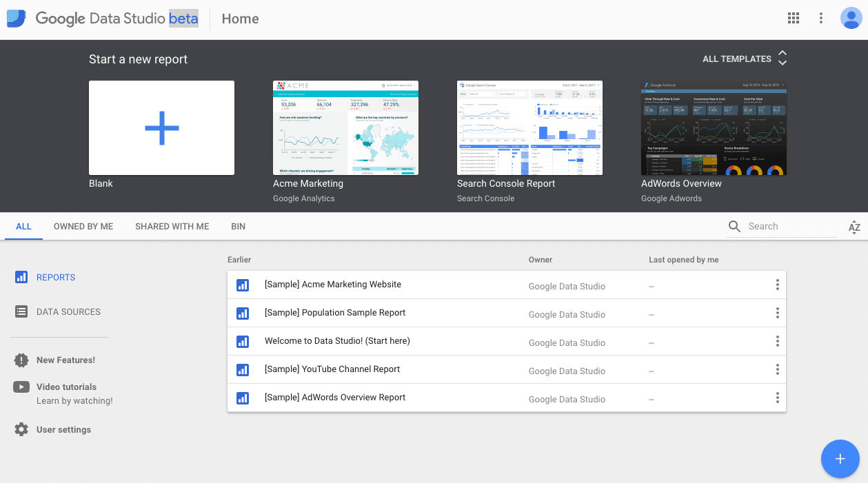
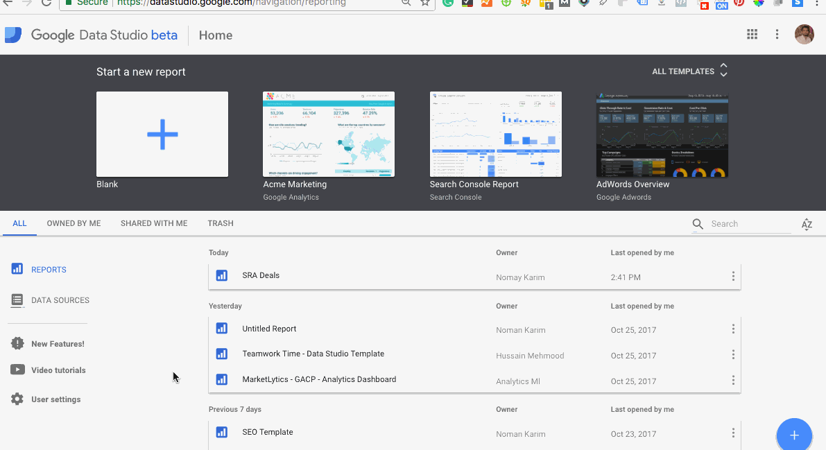
The Looker Studio Home Screen
To get started with creating reports in Looker Studio, you don’t need to fill out any registration form like Google Analytics or Adwords. It only requires an active Google Account. If you are already using any Google product like Google Analytics or Adwords, use the same account for Looker Studio so you can easily connect to any Google data source.
If you are already signed in to your Gmail account, type lookerstudio.google.com in a new tab. This will directly take you to the Looker Studio’s homepage.
Now it’s time to build an awesome report like a boss!

Like Google Docs and Sheets, Looker Studio comes with a few built-in templates to get started with. You can either choose an existing template and modify it or just start with a blank new report.
Clicking on the “All Templates” drop-down displays all built-in templates.
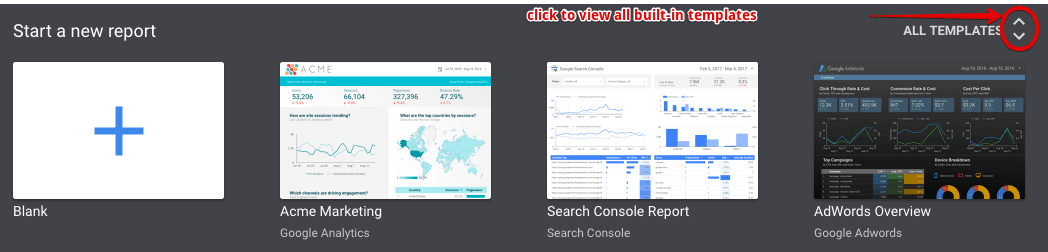
Choose any template that matches your requirements and modify anything you need to change using the editor. Pre-built templates are useful for people with busy schedules as ready-to-go features can save a lot of time..
But for the sake of your learning, we are going to start with a blank report.
Before that, let’s overview the Looker Studio’s homepage.
There are two ways to start with a new report. First is by clicking on the blank plus (+) page on the horizontal header and second is by clicking on the plus icon from the bottom right.
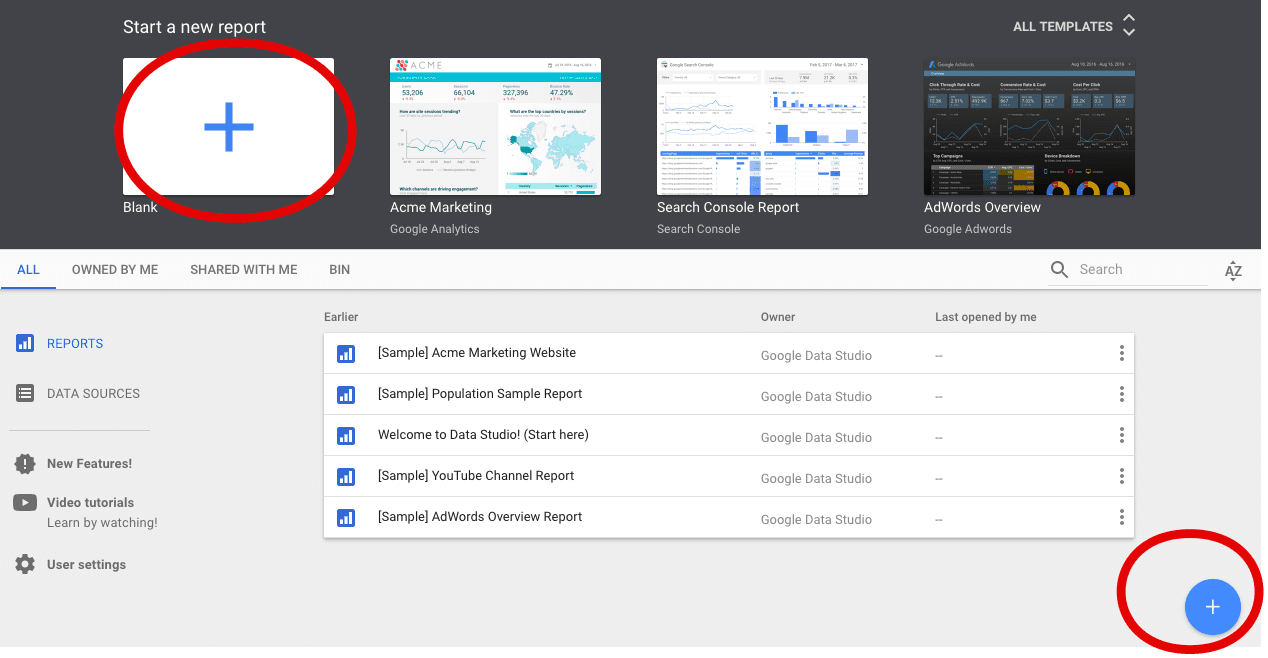
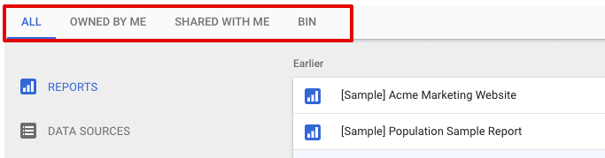
On the homepage you can view sample reports, reports owned by you and those shared with you. Looker studio has got a bin that contains your deleted reports, so you can either restore it or delete it permanently by emptying the bin.
The navigation menu will help you switch between multiple reports.
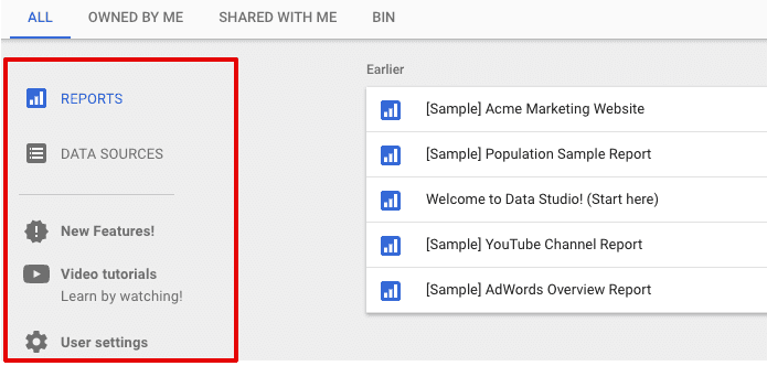
The sidebar menu on the homepage will take you to see the data sources, new features and video tutorial for learning Looker Studio.
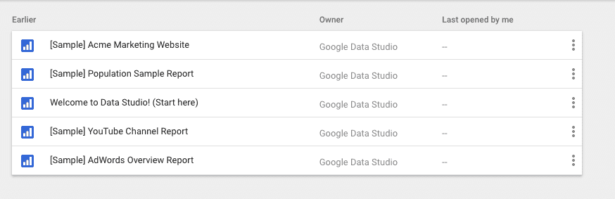
The homepage also has a few sample reports to help you understand how your final reports will look like. Click on any sample report to see how Looker Studio displays data.
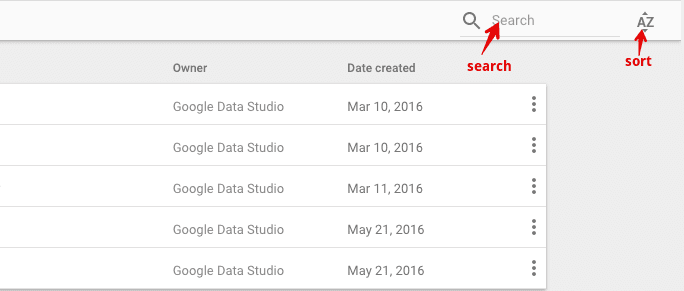
Lastly, the search bar comes in handy when your homepage is flooded with reports and when it’s difficult to find a specific one.
You can also sort the reports by name, recently viewed, the last modified, or just the order in which the reports were created.
Clicking on the AZ dropdown beside the search bar will help you sort the reports.
Build Your First Report in Looker Studio
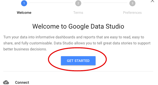
To create your first report, use the methods I mentioned above. Clicking the new report button will display a pop up window with a welcome message.
Click on the get started button on the welcome page.
Accept the terms & conditions and then choose if you want to subscribe the Looker Studio’s newsletter and hit the “Finished” button.
Now click on the new report button again.
Create a Data Source / Connect Google Analytics
Enter a name for your report which by default is named as “untitled”.
As I stated at the beginning that Data Studio extracts data from an external data source. So, you’d have to connect to a separate source that provides data to build a report like GA.
From the right sidebar, you can either select a sample data source or create a new one. But most of users always prefer creating a new data source, so find the “CREATE NEW DATA SOURCE” button if you are one of those.
You can either upload a data file or select a source like Google Analytics, BigQuery, Adwords, YouTube etc.
In my case, I am connecting to Google Analytics because it contains all my website data and I could really use an attractive interface to organize my data.
Once you have selected a specific account, property, and view- click the connect button. Next, you will see the list of metrics and dimensions you can add to the report.
The fields in green are dimensions and in blue are metrics.
To add a new calculated field to the list, click the plus icon, name the custom field and enter the formula for the calculated metric or dimension.
For now, just click the “ADD TO REPORT” button.
Finally, you will be taken to the dashboard.
The Components of Reports Creating Area
Who doesn’t remember doodling and sketching sceneries in windows paint? So by your 3rd or 4th grade, almost everybody learned specific tools and dragging the mouse to draw shapes. In the same way, Looker Studio lets you create reports by selecting a tool and then dragging the mouse around.
But prior to get started with report building, you need to familiarize yourself with different tools and settings.
1. Toolbar
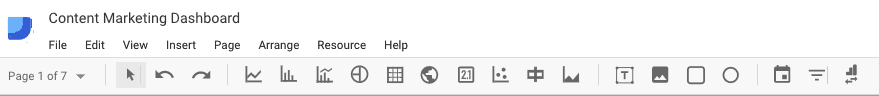
The top bar highlighted in red, the toolbar which allows you to choose among various tools, pages and control options. This toolbar is divided into 5 sections.
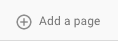
a) Add a page
Looker Studio lets you add multiple pages to a single report. This allows you to group similar reports on each page or have a long report by creating multiple pages.
b) Selection mode/undo/redo

Another great part of Looker Studio is the undo and redo buttons. You can easily switch between your last and next modifications..
c) Types of data visualization
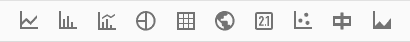
These are multiple types of data visualization tools. You can display your data with a pie chart, a graph, a table or geo map. This section contains the tools to display your data in multiple formats.
d) Add a text/image/rectangle/circle

To make your reports easy to understand, you can add a title or your company’s logo to the report.
e) Controllers
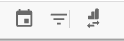
With controllers, you can add date range, add filters and switch between multiple analytics accounts. From left to right are, date change, filter control, and data control.
If you have multiple analytics accounts, you can use data control to view data from other accounts.
2. The Editor
To design a report, select a visualization type from the tools, and on the editor click and drag your mouse.
To delete a report click the one you want to discard and press the delete/backspace button on your keyboard.
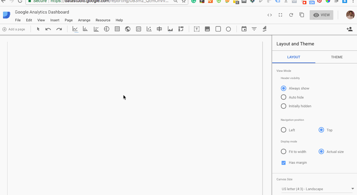
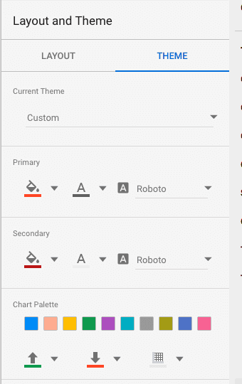
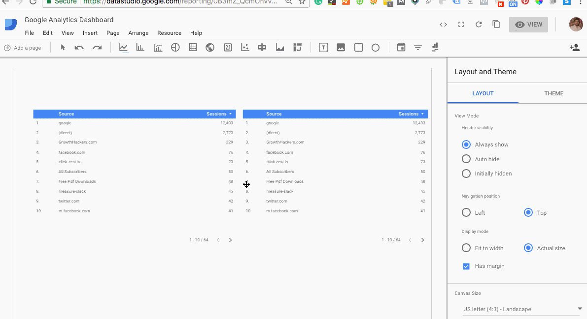
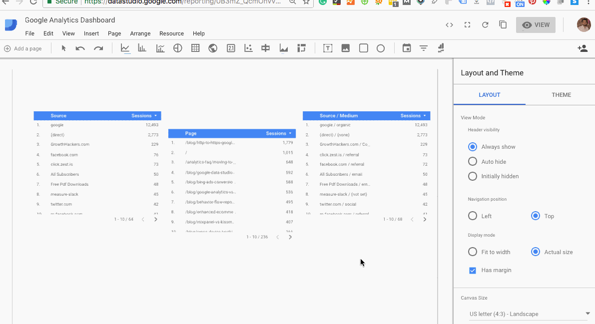
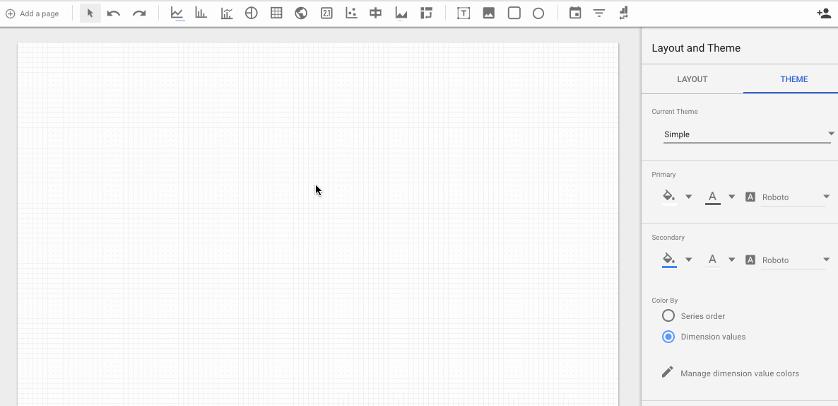
3. Select Layout & Theme
You can set a layout or theme for your overall reports either before you start the process or in the middle of it. You can change the theme background, or text color for all reports.
You will gradually learn these kind of stuff once you get into it. There are a lot of features you can explore by fiddling with options in the sidebar table but as of now, I am covering only the primary ones.
4. Styling and controlling menu
You can also juggle with your data and apply styling. To do this, select a report and from the sidebar under the data column you can:
- Change the chart type
- Select a different data source
- Add or change a dimension
- Add or change a metric
- Choose a default date range
- Apply filter
- Add a Google Analytics segment
Sharing is Caring
Sharing reports in Looker Studio is quite flexible and easy. You can share them like you do with your Google Docs or Sheets. To share a report click on the share icon.
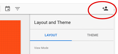
Enter the email address of the person you want to share it with and select if he/she can edit or just view the reports.
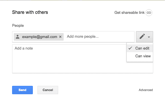
Note: only you are allowed to delete this report and not the individuals you are sharing it with.
Uptil now, you have learned how to draw reports in Looker Studio. Now it’s your turn to create some appealing and organized reports with your bulk of data.
Advanced Looker Studio Tips
So far you have learned the most simple and basic ways of building reports but if you want to explore a few advanced options, I have mentioned some below.
Add New Dimensions and Metrics with Calculated Fields
Calculated fields allow you to control the information contained in your data source. You can add a apply mathematical formulas, transform text and return data based on logical comparisons. For more information about calculated fields click here.
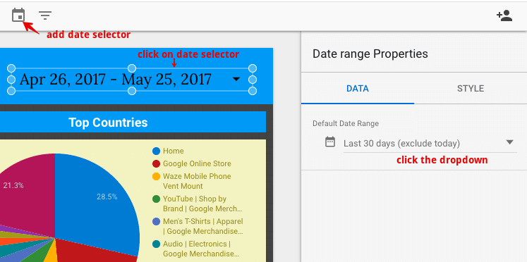
Setting a default date range
As you know that Google Analytics has a default date range of last 30 days and we can’t change it. But in Looker Studio you can change the default date settings to today, yesterday or last 30 days. To do so;
- Add date control to your report
- Click on the date selector
- Now from the sidebar menu under data column, click on the default date range drop down
Next, click on the date drop down and change your default date.
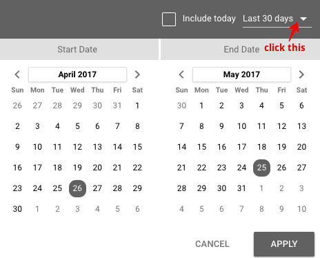
Now the next time you open this report, it will display data according to your preset date range.
Group Multiple Reports
This functionality is very useful in Looker Studio. This helps when you want to apply filters to selected reports.
To do this, select the reports which you want to group by pressing the CTRL/Command button and clicking on the reports.
When you are done with that, right click and select “Group”.
This setting allows you to apply filters to a specific set of reports only.
Aligning reports inline
If your reports are scattered, your readers are most likely to overlook hem, even if the data is highly essential. The best part of building reports is to align them in a way they can easily be comprehended..
For example, here are a few reports you can say are a bit disoriented and can use some alignment.
To align them properly in a single line, select all the reports and from the toolbar menu, navigate to Arrange >> Align Vertically >> Align Top.
Now you have them aligned in a single line!
How to create a widget in Looker Studio
In Data Studio a single report is also known as a widget. Think about the Google Analytics dashboard containing multiple widgets. Data Studio is quite similar to GA dashboard displaying multiple reports.
Let’s learn to create a complete widget in Data Studio.
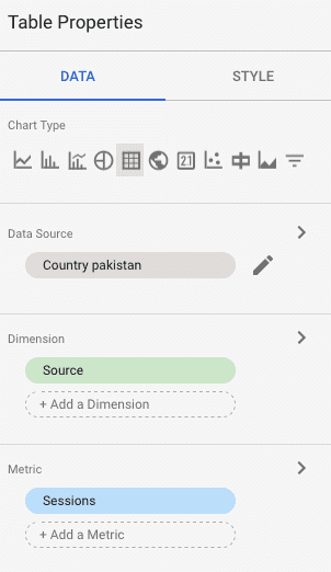
Step 1: Select how you want the data to be displayed in the report/widget i.e pie chart, table, geo map etc. For now, we will create a table widget.
Select table from the toolbar menu and drag your mouse to draw table.
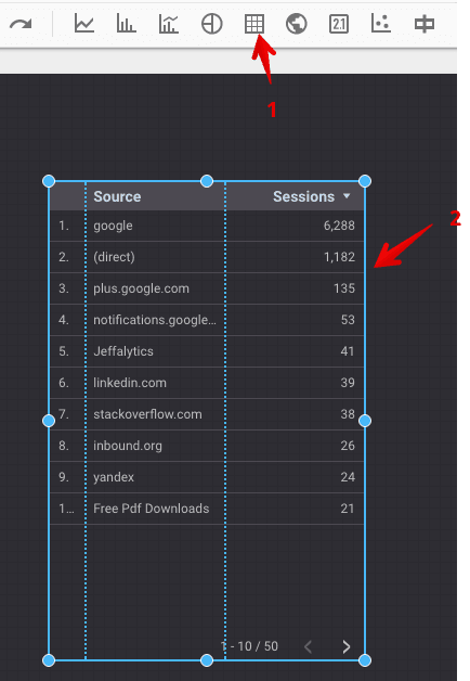
In the above table, the source is dimension and session is a metrics. These are the default dimensions and metrics selected for every report in data studio.
Step 2: To change the dimension, click on the table. From the side bar menu under dimensions click “source” to change or click “add dimension” to add another dimension.
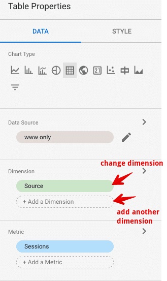
You can do the same to change the metric next to the dimension.
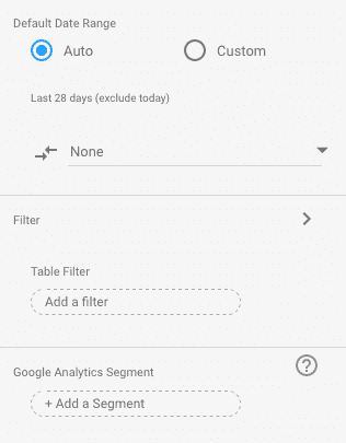
To apply filters and segments to this widget scroll down the sidebar menu.
To style the widget, click on the style tab on the sidebar menu.
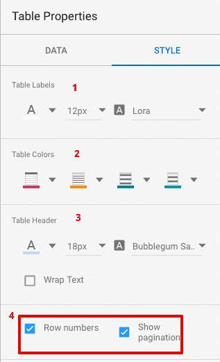
1. Change the text color, size and font family
2. Change the table header and body background colors
3. Change the table header background color, font size and text style
4. Check/uncheck row number to display serial number for each row and check/uncheck to display view more data in the table
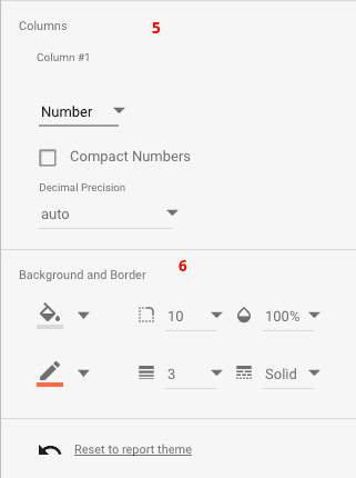
5. Click on the number drop down to how you want to display the metrics data in each columns (you can display data via heatmap, bar and number)
6. Change the table background, border, opacity, border color, border weight and border style.
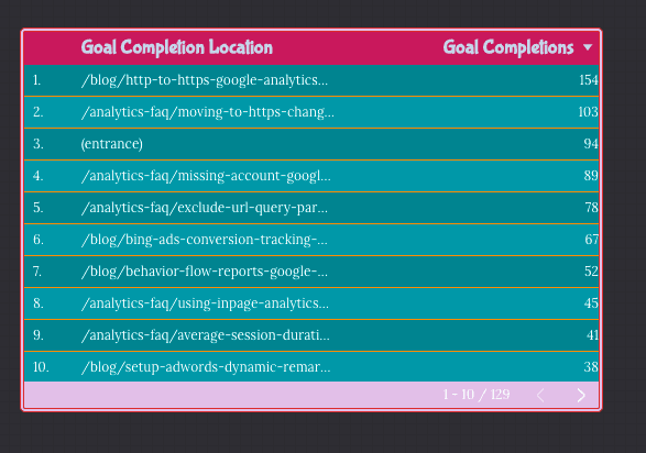
Below is a view of the final widget I created after changing data and styling.
Check the below slides to create a table widget yourself.
Export LookerStudio Reports
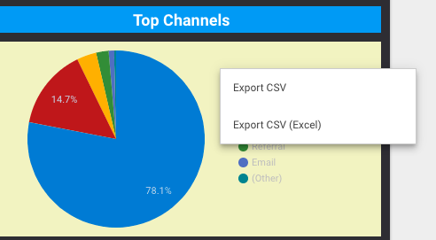
1. Export a Single Chart/Table as CSV
LookerStudio allows exporting a single table or chart in a CSV format. Although you can’t export the whole dashboard or multiple reports in a pdf or other format yet. To export a chart or table:
Click on the view tab on top right to display reports in view mode.
Hover over the chart or report which you want to export
right click and select export CSV
2. Export Whole Dashboard as PDF
There is not any internal functionality added yet, that will help you export reports as pdf. But by using a chrome extension you can do this very easily. Click on the button below to install the chrome extension.
Once you install the extension, open your DataStudio dashboard in view mode and reload the page. You will then see “Export to PDF” button on top right of the page.
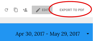
This will take a little time but will allow you to export the whole reports regardless of number of pages to a pdf format.
Our Additional Looker Studio Resources:
Google Looker Studio Template for Content Marketers
Best Google Looker Studio Ecommerce Template
Become a Google Looker Studio Pro With These Easy Tips